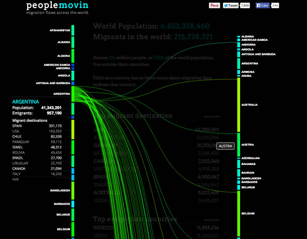
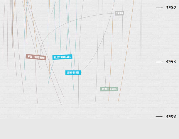
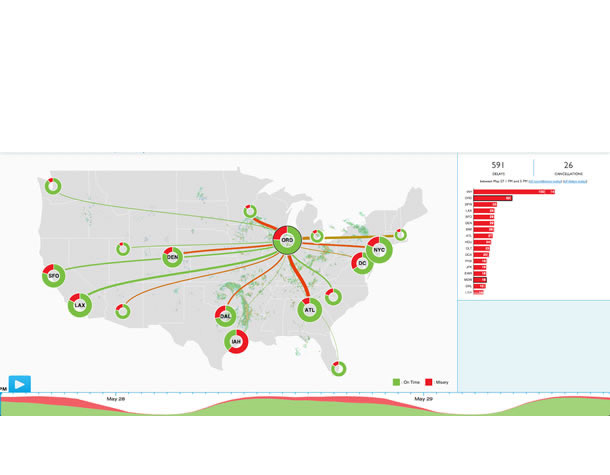
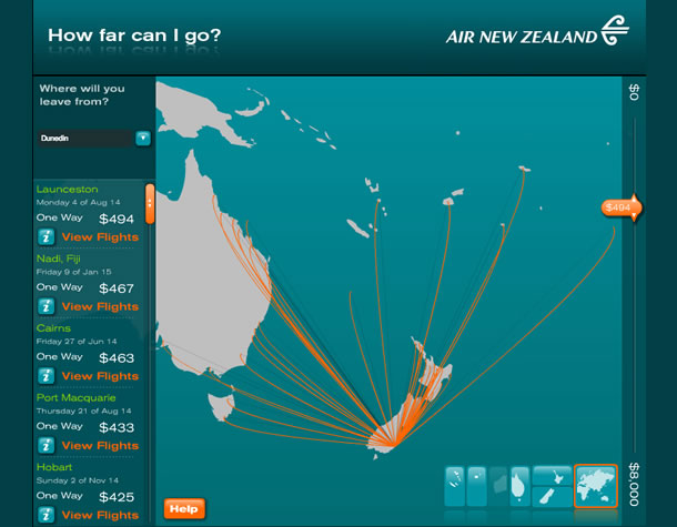
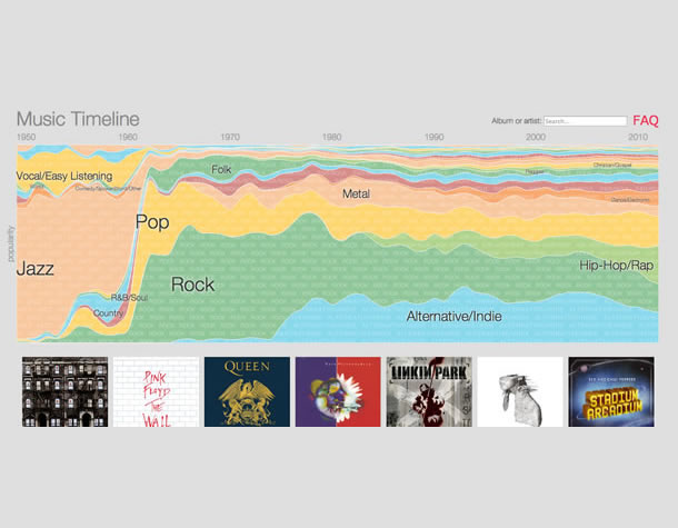
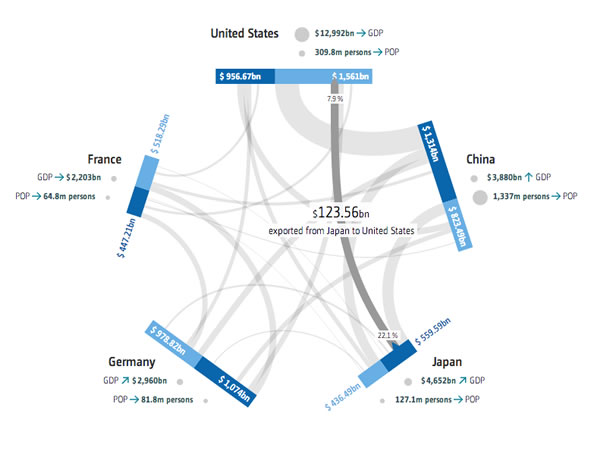
Information visualization, the practice of representing a set of data visually, has been an infatuation of UX design for some time now. The method is meant to make data easy to understand and to communicate. But how often have we seen impressive graphical representations of data where we hadn’t the slightest idea of what the creator was trying to explain? So many visualizations fail to incorporate basic UX principles.
Add the element of interactivity and the data may become even more muddled. In static visualizations, an entire set of data needs to be understood at a glance. But interactive displays enable readers to freely explore an entire data set, or to focus on a specific subset of that data. The increased complexity and level of specificity could easily cause more confusion than comprehension.
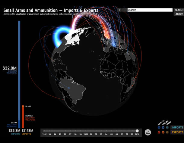
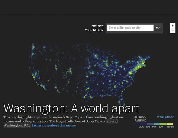
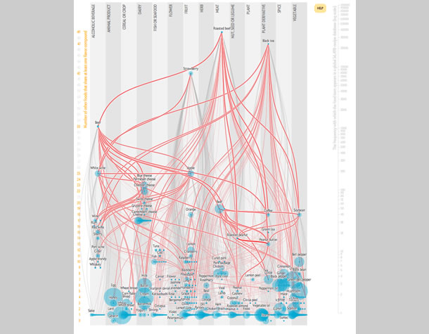
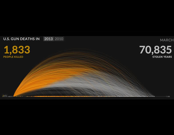
There are six basic principles to help you create effective information visualizations and interactive experiences. The accompanying slideshow offers example visualizations, along with explanations for what makes them succeed or fail.
1. Know your Role
With a visualization, you are telling a story. And like any good story, a good information visualization conveys information progressively. Your story should have three elements: a primer, a plotline/storyline, and a conclusion.
In an interactive visualization, the primer may take several forms, including:
- Animation to introduce the visualization
- Instructional text to explain the visualization
- Instructions that are revealed gradually as the user interacts with the visualization
In the primer, it’s important to reveal the purpose of the visualization and how the interactions work. The big “What should I understand here?” or “Why should I care about this?” is often expressed in the title. Clues about how the visualization functions are generally given in textual or symbolic form as an invitation to interact.
The storyline is where the user reads and interacts with the visualization. It steers the user to a conclusion. Then the conclusion is the takeaway—what the user retains after interacting with the visualization.
2. Define the Message
Before you start to structure information in a visualization, it’s crucial to identify what you’re trying to communicate. All the stylistic and structural decisions you’ll make should support the transmission of this message. Steer clear of vague or sweeping goals such as, “We’ve got a set of data that we want to represent.” An information visualization isn’t an exercise in data synthesis; it’s an exercise in making data understandable to a wide audience. Far beyond representing data, a well-designed information visualization makes data compelling, guides users in interpreting it, and engages them to draw a conclusion. An absence of guidance places the burden of interpretation entirely on users, alienating all but the most rigorous and motivated, and therefore diminishing the project’s impact.
Two qualities mark a well-crafted message:
- Simplicity: A message that’s easy to understand will have more impact than a message that isn’t.
- Specificity: A precise, narrowly defined message enables the user to draw a meaningful and relevant conclusion. A vague or ambiguous message may lead to a vague or ambiguous interpretation.
3. Structure your Visualization
A visualization may have up to three levels of specificity, or three views onto a given representation of data: the macro, meso, and micro views. Each affords a different interpretation of the information. When developing a strategy for your message, be sure to define the appropriate level(s) of specificity and set the order in which you’ll expose readers to these views, so as to support them reaching a conclusion.
- Macro (or systemic) view. The macro view presents the entire set of data. It’s typically used to communicate patterns or trends in the dataset rather than to surface specific data. These patterns or trends are central to a visualization’s message.
- Meso (or local) view. The meso view of a visualization presents data in a way that’s detailed enough to let users distinguish individual data points, compare them with one with another, and spot similarities and differences. Make use of this view to provide context for the data that’s displayed. At this level, avoid bombarding users with more details than they can reasonably absorb. Instead, enable users to isolate and examine a subset of the data by allowing them to zoom in on a section of a visualization, for example, or by positioning elements in 3D space.
- Micro view. The micro view reveals detailed information or explanations of individual segments of the data. These details typically appear when an individual segment of the data visualization is selected.
4. Format your Visualization
Although the structure of your visualization is crucial, structure alone won’t guarantee effectiveness. Stylistic choices can make or break the quality of an information visualization experience. Here are some aspects to consider.
Emphasize important elements
When making stylistic decisions, aim to guide users in reading the visualization. In doing so, the following strategies suggested by gestalt principles are helpful.

Figure 1. Placing elements beside one another reinforces the perception that they are related. At left, proximity has the desired result. At right is an unintended pitfall of proximity: close elements are perceived as part of the same group when they really aren’t.
Group by proximity. Elements that are close to one another are perceived to belong to the same group (Figure 1). In creating your visualization, ensure that unrelated elements aren’t inadvertently grouped together. On the flip side, placing related elements beside one another in space will reinforce the perception that they are related.

Figure 2. The dots in two different colors are perceived as belonging to two different groups, irrespective of their positions.
Group by similarity. By the same token, elements with similar visual characteristics for example, color, shape, or size, are perceived to belong to the same group (Figure 2). Again, it’s important to be sure that no visual groups are inadvertently created in your visualization. Use this strategy to highlight similarities between elements. You might decide to use the color red to identify all problematic elements. Or you might accentuate the differences between two groups by creating contrast in their shape or size. Use grouping by similarity wisely, preferably to distinguish two or three groups at most. Above this limit, too many visual characteristics compete for attention and make it difficult to decipher the main focal points.
If too many groups are portrayed in a visualization, it becomes important to prioritize the information according to the message you’re trying to convey. Generally, you’ll want to emphasize one category of information at a time. Use animations or a navigation scheme to enable users to transition from one category of data to another. And help the reader focus by highlighting information at the right time.
5. Then Add Interactivity
Interactive visualizations have an advantage over static visualizations in that they convey a message in multiple steps. This creates a narrative that encourages readers to move from one step to the next. After all, engaged readers retain a message more effectively than passive ones. Only after the foundation and direction of the visualization are set do you decide the interactive elements.
Clicks, taps, and other gestures
Clicks or taps are the most prominent interaction paradigms for information visualizations. If other gestures (scroll, pan, etc.) trigger behavior, it’s important to make them obvious to the reader. Choose your gestures wisely; not all visualizations lend themselves naturally to all gestures. Rotating a spherical visualization, for instance, would be more intuitive than rotating a linear one.
Guidance and anticipation
Enable the reader to anticipate the effect their clicks, taps, or other gestures will have. For example, if a user may filter data by clicking on a heading or other visual element, make this behavior obvious so that user doesn’t have to guess what will happen.
Animated elements
Animation reveals information gradually rather than all at once. This creates a narration that works well if your visualization tells a particularly complex story.
Animation also is useful in transitioning from one view of the visualization to another, say, from a macro to a meso view. In some cases, animated transitions are useful in orienting the user. A zoom animation may help readers understand that they’ve focused in on a specific region of the visualization.
Animation may also be used to draw attention, give further explanation, indicate what a reader should do next, or demonstrate how to interact with the visualization.
6. Choose Graphical Treatment and Copywriting
Once you’ve defined your visual communication strategy, you’ll need to decide what sort of graphic treatment and textual tone will best convey your message, support your structure, and enforce your style. Generally, you’ll want to turn to specialists in information and graphic design to ensure that your graphic treatment and tone of voice coheres with the message you’re trying to convey.
Putting it Together
In summary, focus on defining the message of your visualization and create the story you’ll use to convey it. As the storyteller, how will you set up the story (for instance, what will users see first)? How will the story unfold (what different views will users be exposed to, and how will they interact)? Above all else, an interactive visualization is meant to be useful. It conveys a message and generates understanding without imposing the burden of interpretation on the reader. An interactive information visualization is a story in which readers play an active listening role. The easier it is to understand, the more impact it will have.
Happy designing!
More reading
- Making Data Visualizations – A Survival Guide by Gregor Aisch
- Data Visualization – Best Practices by Jen Underwood
- I Like Pretty Graphs – Best Practices for Data Visualization Assignments by University of Wisconsin-Madison DesignLab (video)
- Top Trends in Data Visualization 2013 by Scott Murray (video)
- Beyond The Pie Chart: Creating new visualization tools to reveal treasures in the data by Hunter Whitney (UX Magazine)
- Five Steps to Storytelling with Data by Dominic Quigley (UX Magazine)
- Gestalt Psychology from Wikipedia.
Retrieved from https://oldmagazine.uxpa.org/look-at-this/
Comments are closed.

