Designing for Conversations (Book Review)

A review of Conversations with Things by Diana Deibel and Rebecca Evanhoe details this indispensable guide to all things chat and voice. This book includes practical design guidelines and purposeful guidance on privacy and inclusion. Topics include talking like a person, basic and advanced design considerations, and guidelines for implementation. [자세히 읽기]
Connecting UX and EX: Better Employee Experience

By viewing the employee experience (EX) through a user experience research and design lens, companies can constantly gather meaningful data to learn and make ongoing, iterative improvements to employees’ working experience, which significantly impacts employees’ lives and affects overall business performance. [자세히 읽기]
Aggregating Insights: Survey Templates Build Cumulative Knowledge in Iterative Product Development

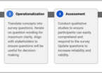
UX researchers often write bespoke surveys to evaluate each new product or feature set with users, resulting in duplicate work, slower launch cycles, and limited opportunities to compare user sentiment across different features. We developed a process at Google™ by creating feature-agnostic survey templates to evaluate all new features in a product space. Product teams can conduct meta-analyses on aggregated responses from previous launches to build a cumulative body of knowledge with deep insights. [자세히 읽기]
Designing for Big Tech: Top Lessons from a Junior UX Designer at PayPal

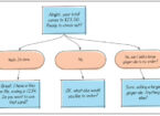
A UX designer explores what it means to work as a junior designer at an influential big tech company. He shares his top four lessons learned from a two-year journey at PayPal™. Lessons include embracing the unhappy path in design, designing and collaborating in a fast-paced environment, balancing product design with product management, and learning continuously at the intersection of business, design, and technology. [자세히 읽기]
Color Contrast: Infographics and UI Accessibility

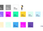
Sufficient color contrast is a prerequisite for readable text and accessible websites, and visual contrast has a significant role in the updated Web Content Accessibility Guidelines (WCAG 3.0). Unfortunately, contrast is often given secondary importance by designers in lieu of other design elements. This article discusses color contrast for text readability and user interface design, the criteria for minimum color contrast of varying sizes of text, and methods to verify and improve your color contrast ratio, including interactive tools. [자세히 읽기]
Schemas: Strategizing User Experience

Schemas inform people in performing the simplest tasks to entering data in complex systems such as Electronic Health Records. People use assimilation and accommodation to adapt schemas to new situations, but overreliance on users’ accommodation affects cognitive load and usability. Understanding schemas informs a strategic user experience that focuses on cognitive skills. [자세히 읽기]


